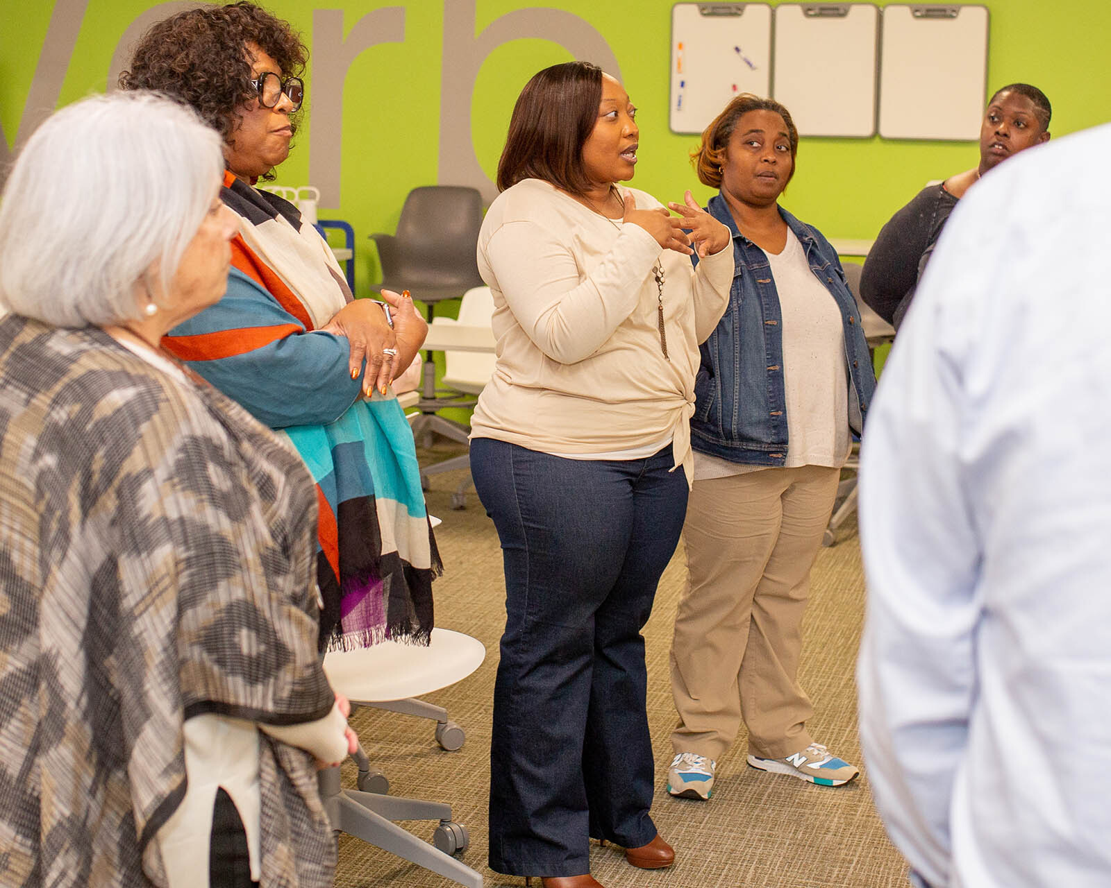
Whether you teach in a traditional classroom or online, you have experienced what it’s like to design a brilliant lesson that resonated with your students. Interested in taking those same design skills in a new direction with some graphics? Fear not, the basic prinicpals of design are at your fingertips.
Whether you teach in a traditional classroom or online, I’m sure you have experienced those moments of great fulfillment, and giddy joy, when you created a masterpiece of curriculum for your students. The lesson was brilliantly composed, painstakingly crafted, incredibly adaptable, and it was fit for a museum gallery. Admit it, you felt a little bit like Monet (or even Picasso) and you should have.
Up the ante.
Why not take your skills in a new direction? How about using what you already know about communication and audience to get your message out beyond your classroom?
Social media is all about short messages and strong images. A photo can help your audience quickly understand why they should care about what you care about, too. Powerful imagery can help transcend language barriers, cultures, and generations. And, a shareable graphic that speaks to your audience can go viral with a just a few likes, shares, and tweets.
You may be thinking that you have no experience in graphic design, but as a teacher, you already understand the most essential elements of creating engaging messages. You have the head and the heart to share your message in a way that gets heard.
Don’t worry if your hands don’t yet have the practice to create images because CTQ is here to help. In each new blog post, I will share information about how you can create your own Facebook cover photos, social sharing images, and even infographics.
Let’s get started!
Here are the core principles of design to consider. If you’re ready to jump in, focus on one of these elements at a time in the images you have in mind. Check out the images I created for a fictitious organization to illustrate each one:
Contrast
Contrast creates juxtaposition and can help emphasize a part of your visual message. I used a contrasting color for the word “immigrants” to call attention to the message.
Repetition
Recurrence of a shape, color, or object can create balance and connectedness for your design. I reused the color of the hands in the call to action box. Really brings this Facebook cover photo together, eh?
Alignment
Use graphic elements to create visual connections and intentionally create order with symmetry and balance. Using the hands as a guide, the text is aligned to keep the reader moving down through the information on the flyer. No way they’ll miss this rally.
Proximity
Playing with spatial relationships creates visual units or sets elements apart to get noticed. The tightness of the text and emotional image encourages people to click this image and sign a petition. The color balancing draws attention to the message too.
Get out your gestalt.
With these principles in mind, start brainstorming your own graphics right now. Remember that you don’t need to get too wrapped up in the nitty-gritty of designing at first. Just think about your message and the passion you have for sharing it. All you need to create an engaging visual is some gestalt – your own unique sense of visual unity and passion for a purpose.
Share this post:
Author
Related Posts
September 13, 2021
Pause, ponder, then plan:
Cultivating Communities of Impact
February 23, 2021